An Oklahoma City-based muralist, lettering artist and illustrator. With her bold and vibrant designs, Aditi can transform your space and empower you with tools to help you shine!
Equity Brewing Co. Beer Label DESIGNS
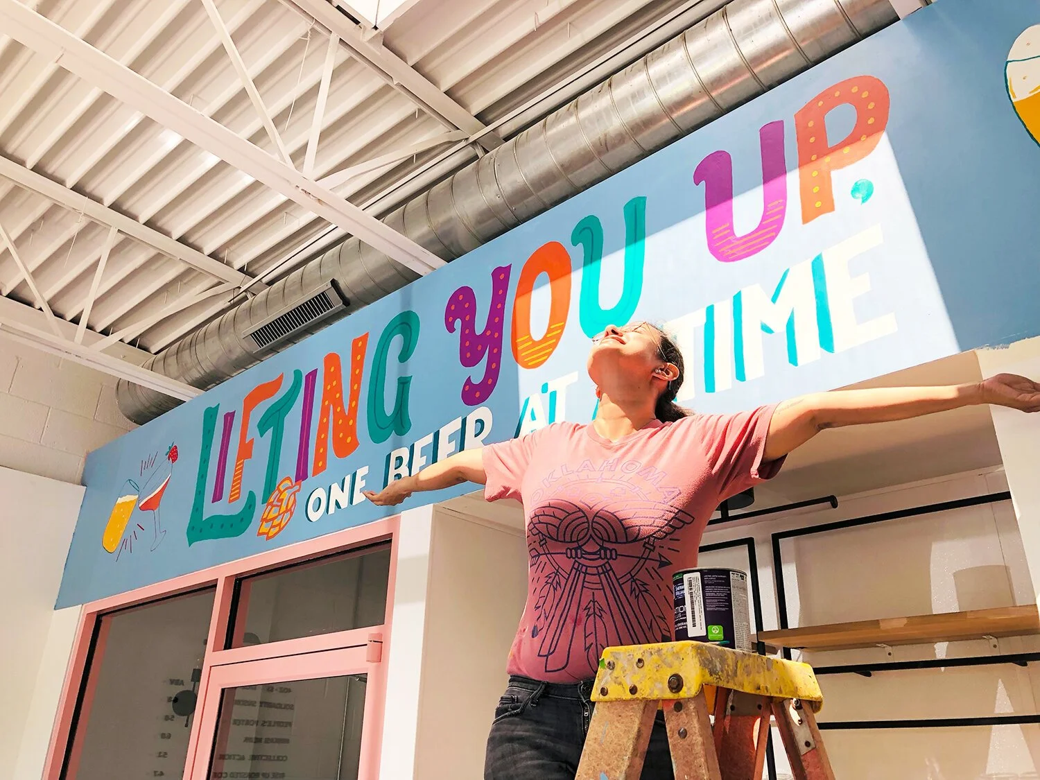
Not only did I get to work on a mural in Oklahoma’s first women-owned brewery that is Equity Brewing co.’s new space last year, but also got to design 4 beer labels for them! When Suzette, the owner of Equity Brewing Co and I chatted over the phone, her excitement for the flavors she was wanting to brew and sell told me how passionate she was about them. I did a lot of research for the four different labels, and wanted to make sure they would work independently as well as next to each other on the shelves. Something I really love about Equity Brewing Co. is how bright and inviting the brewery feels. I strived to encompass the same feelings in the beer labels. Each label boasts of a different art stye, but they all share the same message - Connection and Unity. From the icons representing feminism and rebellion on the "S.M.A.S.H. the System" to the koi fish in the lotus pond on the "Persistence Pale Ale" that represent perseverance, they all work in harmony.